Non-profit work

Case Study
Echo Church
Echo.Church needed a new app to enhance attendee engagement by allowing users to connect, sign up for events, and access a newsfeed with updates, blogs, social media, and special events. Their existing app was merely a hub that linked to external browser-based sites and was optimized only for iOS. In early 2019, I collaborated with a volunteer team of professional developers and product managers to redesign the app. Our primary goal was to create an app that was both relevant and valuable, encouraging attendees to use it regularly and increasing their engagement with the church and its resources.

Previous site
The initial version of the Echo.Church app was effectively a collection of browser links rather than a true app, resulting in a confusing navigation flow and fragmented visual design. It did not adhere to iOS or Android design patterns, rendering it ineligible for download from the Apple App Store and Google Play.
Goal planning
The first step was to meet with stakeholders and the product team to establish clear goals and review metrics. We discovered low download rates and minimal user engagement. By analyzing metric data and reviewing Echo.Church’s messaging and branding, we collaboratively redefined our objectives to enhance user engagement and better align with the church’s mission.
Base wireframe
I developed a simple wireframe to summarize the identified needs and facilitate initial discussions. This straightforward visualization served as an effective starting point, allowing for quick scanning and explanation before delving into the specifics. Gathering feedback from these early, simplified presentations was crucial for refining and developing a more detailed user journey.
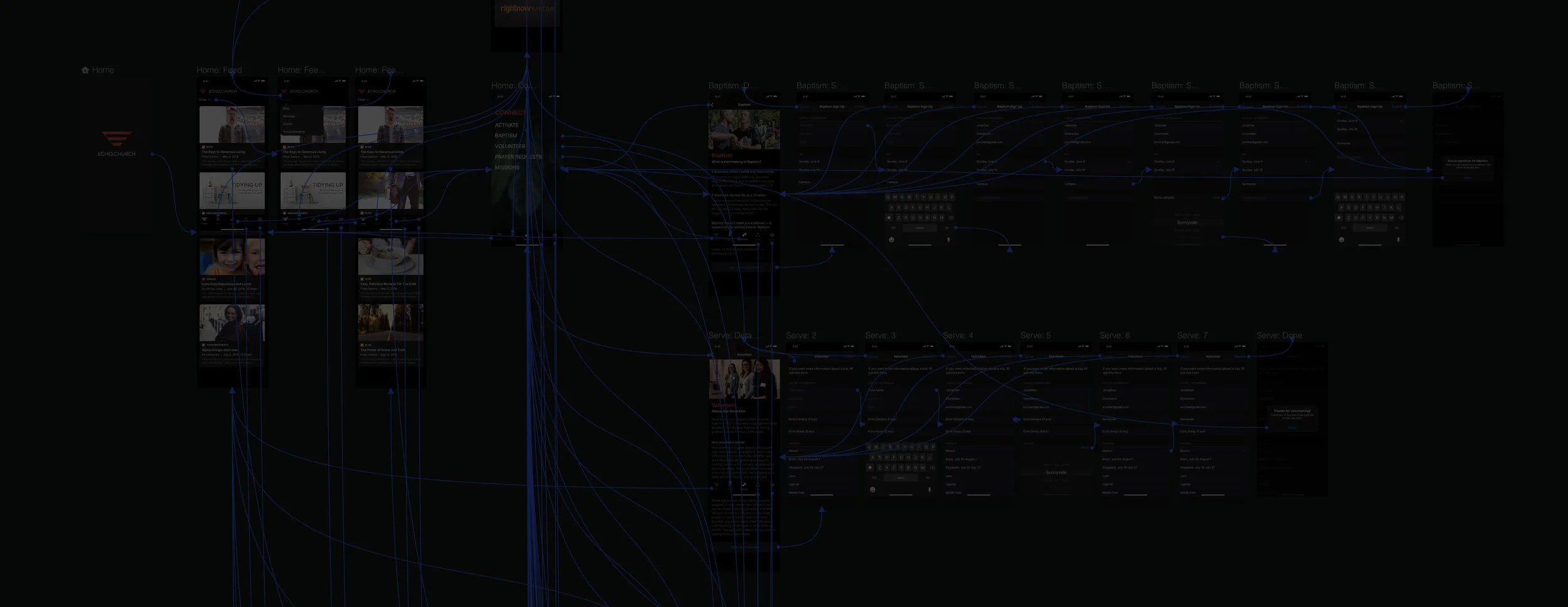
The user journey
Incorporating feedback from the product team and stakeholders, I developed a new user journey that outlined navigation decision paths in detail. While the initial wireframe mapped out the path from the home screen to feature-level pages, the updated user journey delved deeper, integrating feature-level screens and clarifying their interrelationships. This approach extended the flow into detailed screens, providing a comprehensive view of user interactions and navigation.

Visual design directions
Once we finalized the site architecture and user journey, I explored current visual design trends and available technologies. I developed several design directions using Sketch and created interactive prototypes in InVision Studio. These prototypes were used to present navigation and visual elements, allowing us to assess usability and gather user feedback on their reactions.

Interactive prototypes
After selecting the visual design direction, I developed a detailed interactive prototype using InVision Studio. This prototype brought the design to life, showcasing dynamic interactions and visual elements, allowing us to effectively test and refine the user experience before final implementation.
User testing
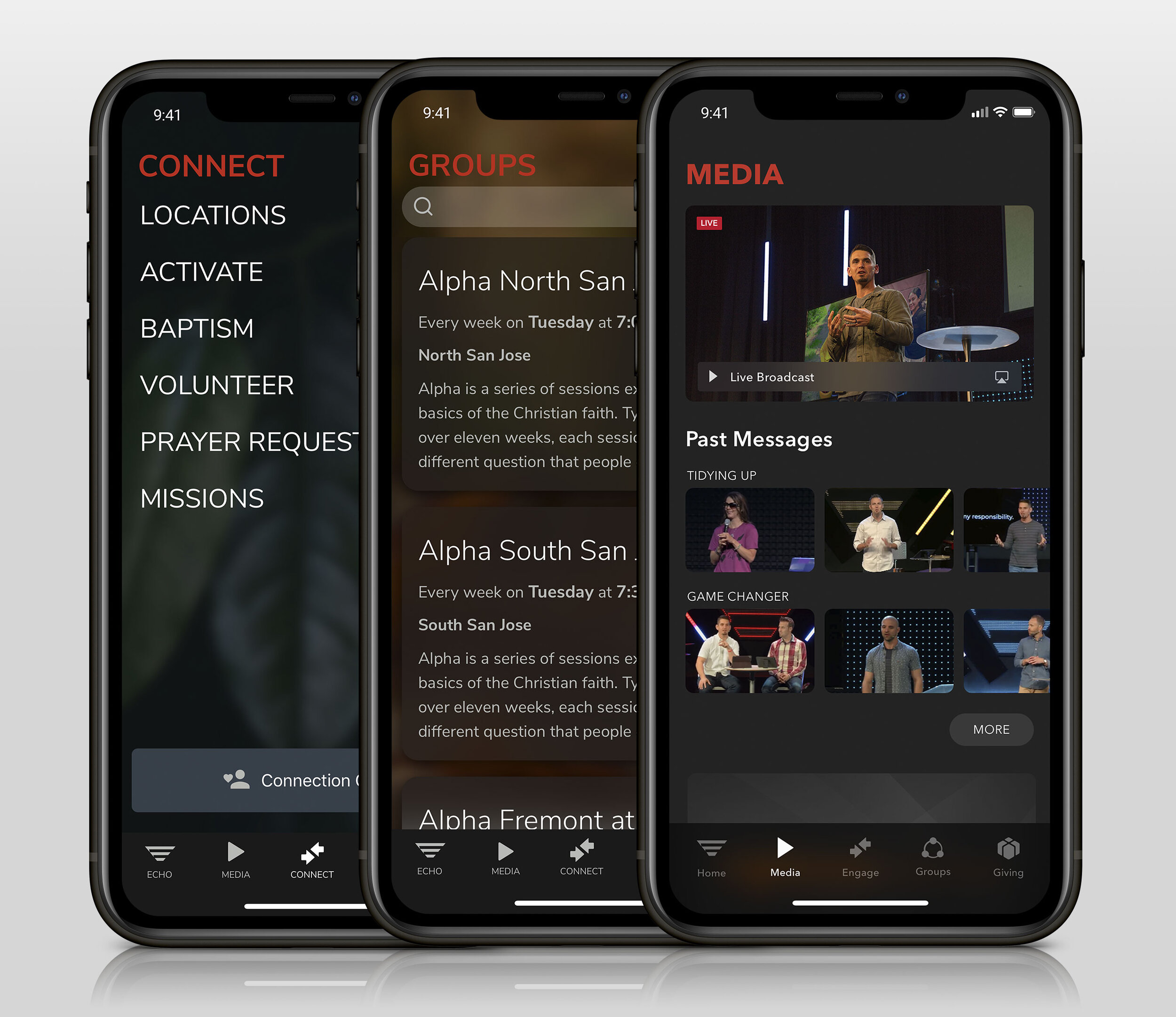
After developing the prototypes, user testing was crucial to identify the best design solution. Testing interactive prototypes on actual devices allowed us to observe how users engaged with different platforms, such as iOS and Android. I created prototypes in InVision Studio for both iPhone and Android, gathering valuable feedback and data from real-world usage. This hands-on testing was essential for refining the design and ensuring it met user needs effectively. Below is an example of the iOS prototype we tested on an iPhone.
Collaboration
After analyzing user research and client feedback, we proceeded with development using the iOS and Android development kits. Throughout this phase, I maintained close collaboration with a skilled team of volunteer iOS and Android developers to address any issues during implementation. We tackled challenges such as platform updates and new device hardware specifications—such as Google’s upcoming “Dark Mode” for the Pixel 4. We used Test Flight and Expo to upload and test the prototypes on various devices, ensuring smooth integration and functionality.

Planning and client meetings
The initial stage involved engaging key stakeholders, including the Lead Pastors and Technology Teams at Echo.Church. We presented the issues with the existing app, including low engagement and download metrics, and proposed solutions for the next iteration. Nick Kurat, the lead product manager, played a crucial role in setting deadlines, organizing meetings, and managing client relations.
Design and build
I collaborated with a volunteer team of professional developers to design and build the new site, meeting primarily at our temporary office in Panera Bread outside our regular work hours. Phillip Trent served as the lead iOS engineer before joining Apple, while Dereck Quock led the engineering and development for the Android platform.
Launching on the App Store & Google Play
After over a year of meticulous planning, design iterations, development challenges, and user testing, we proudly launched the new Echo.Church App on both the iOS App Store and Google Play Store. The app is available for download today, and since its launch, we’ve seen a significant increase in downloads and received positive feedback from users.
