Brand
A well-designed brand powerfully conveys a company’s values and mission, forging a strong emotional connection with customers. Crafting such a brand requires dedicated time for detailed sketching, thoughtful consideration, and thorough client reviews to ensure it truly resonates.
FaithFull Magazine Cover
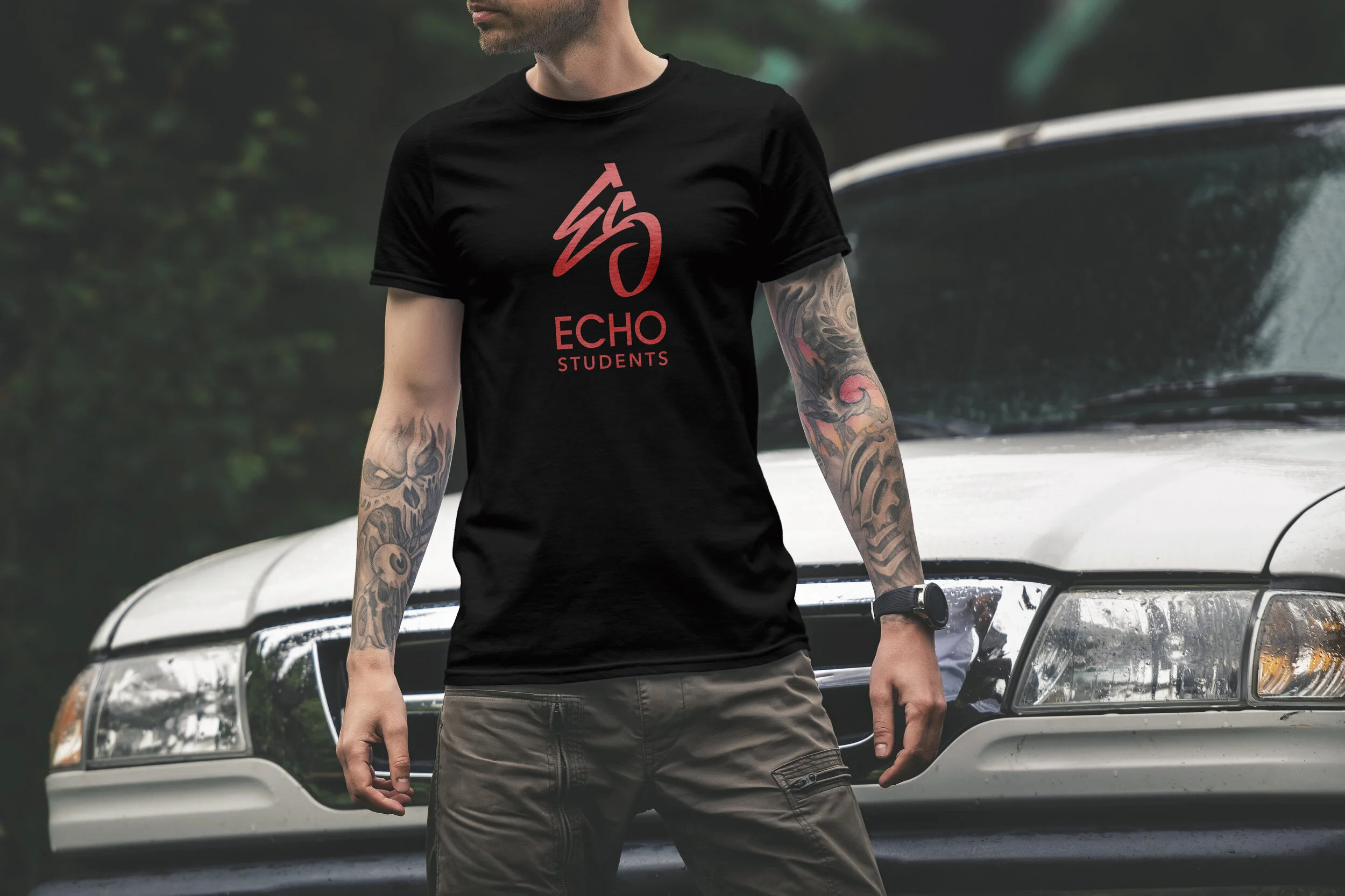
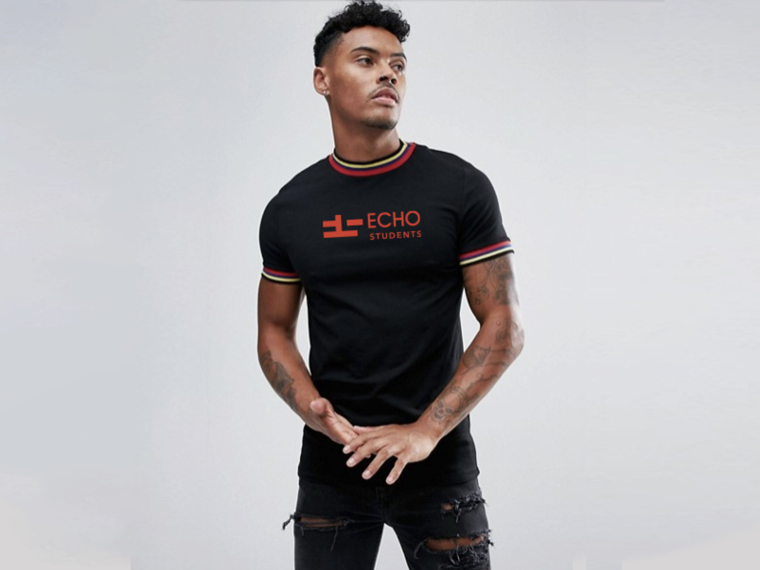
Echo Students Logo Apparel Design

Echo Students Logo Graffiti Design
Facebook Blueprint Logo Design
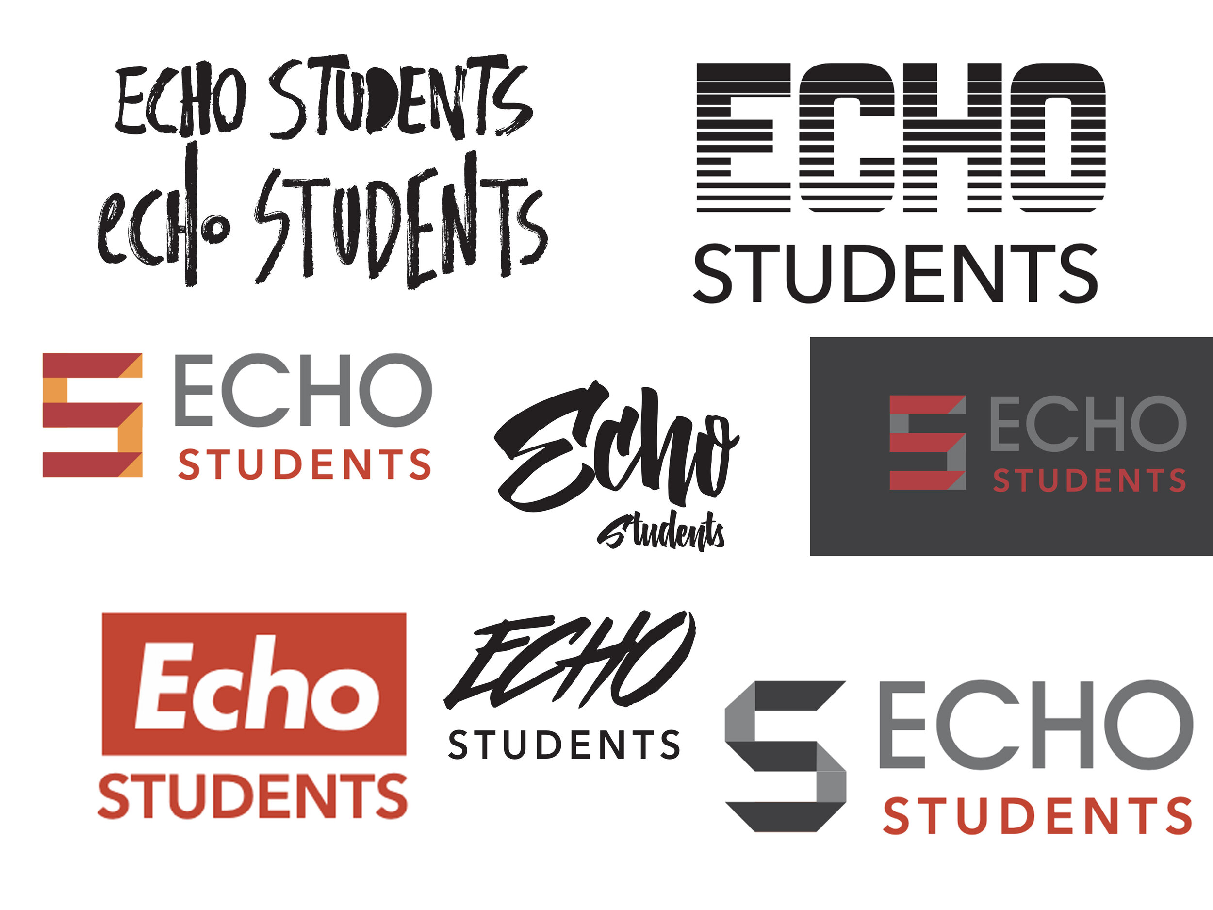
Echo Students Logo Design Direction

Echo Church Logo Apparel Design

Case Study
Echo Students
Echo.church is a Bay Area organization with multiple campuses across Northern California. Echo Students is a community within the organization focused on student ministry and mentorship. Their branding needed a refresh to better connect with the teen and young-adult demographic while aligning with the overall Echo identity.

Existing Logo
The previous logo for Echo Students combined elements from the Echo.Church logo with an arbitrary font style. This approach diluted the program’s distinct identity and failed to resonate with the target student audience. The result was a brand image that did not effectively represent the program or engage its intended demographic.
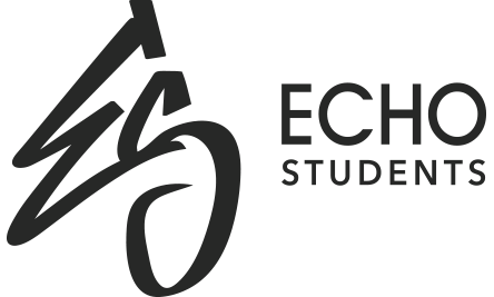
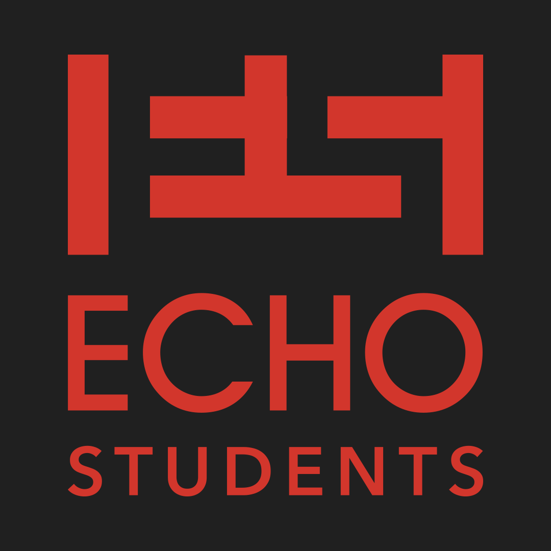
New Logo
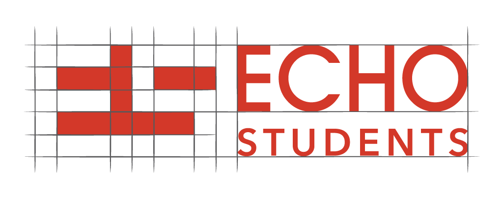
The final iteration of the new logo eliminated the direct reliance on the church logo, resulting in a fresh and relevant design that better engaged students. The treatment of the “e” subtly nods to the Echo brand while establishing a distinct identity for the program.
Process

Sketching
I began the design solution by sketching concepts on paper and quickly iterating ideas in Adobe Illustrator. This initial phase included exploring negative space and incorporating graffiti-inspired motifs.
Audience trends
Through user research conversations with teens about current fashion trends, I discovered that they are drawn to a blend of 80s retro styles, video game aesthetics, anime influences, handwritten elements, and a mix of horizontal and geometric patterns.
Narrowing down directions
Further research and brainstorming refined our options to three distinct directions, which we presented to the client in the context of apparel. One example, the “Minecraft” direction, featured an abstract use of negative space with subtle references to anime and video games.
Details
Although the final choice leaned towards a more handwritten style, the emphasis on order and balance became a deliberate element in my logo design process. Even with more organic shapes, the designs maintain a foundation of geometric principles.
This approach was particularly compelling due to its use of negative space and strict adherence to line width. The abstract forms reveal a nuanced and inclusive experience, with the shapes created by filling the negative space being both unique and iconic.
Final logo design
The final design chosen effectively captures the essence of youth and self-expression. It resonates strongly with the target audience, making it appealing and “cool” to wear. Additionally, the design reflects the church’s commitment to inclusivity, portraying it as a welcoming and open environment. The positive reception and engagement with the design underscore its success in aligning with both the brand’s values and the preferences of the community.


Inspiration
The craftsmanship of traditional logo design serves as a profound inspiration for me. The process of collaborating with clients, exploring numerous iterations, and prioritizing creativity over perfection has shown me that the best ideas often begin with pencil and paper. Drawing inspiration from iconic designers like Paul Rand and Saul Bass, I appreciate logos that seamlessly blend balance, negative space, and mathematical principles. Their work has greatly influenced my approach to creating impactful and timeless designs.
British Steel designed by David Gentleman in 1969, Copyright British Steel Corp
Negative Space and Mathematical Balance
David Gentleman’s logo design for British Steel is timeless in its simplicity. His use of negative space and mathematical thinking is used to define proportions.

Saul Bass designing the Bell System identity in 1969. Copyright Bell Systems
Saul Bass
Saul Bass was a true pioneer of design communication and innovation. His design of the Bell system logo and unique cinematic pitch has influenced my logo design and artistic approach.
Saul Bass Pitch Video For Bell System Logo Redesign.
Designing the the Piccadilly Circus sign in London in 1954. Copyright Coca-Cola
Craftmanship
This image always appears in my mind whenever I think about logo design. Oftentimes, organic hand-drawn shapes have underpinnings of order and ratios.